- /
- blog/
- Maps as Models/
Maps as Models
I’ve been fascinated by maps for quite some time. It’s hard to pinpoint exactly when this interest began, but it took me a while to realize why they intrigue me so much: it’s because maps are models.
When I was a child, we had a globe with a built-in light bulb. When switched on, underwater reefs and cliffs would light up. At the time, I didn’t fully understand it, but I was captivated by the idea of switching between different perspectives of the same object.
In this way, a map becomes a model of the world. The cartographer decides what is shown and what is left out, what is emphasized and what is downplayed. These choices can be subtle and not always deliberate: even something as basic as drawing a coastline between land and sea is a choice—though an obviously useful one for everyday use. It becomes much more complex when considering features like national borders, transportation systems (roads, railways, etc.), or human settlements.
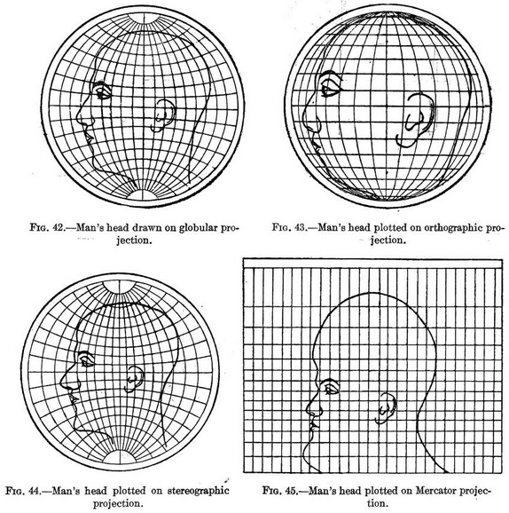
In many cases, we take maps for granted, but they are far from objective. There’s a well-known illustration from the 1921 book Elements of Map Projection with Applications to Map and Chart Construction that shows four different map projections on a man’s head. This seemingly technical choice has enormous implications for how we perceive relative size and distance.

Looking at old maps makes this even more intriguing. Maps offer us a glimpse into how people of the past viewed the world around them. A fascinating example is Olaus Magnus, a 16th-century Swedish bishop and amateur cartographer. His Carta Marina is a relatively accurate depiction of Northern Europe but is filled with detailed illustrations, some depicting everyday life and others mythological creatures. I find it fascinating to study this map online.

Some of these old maps continue to shape how we view the world today. In 1507, Martin Waldseemüller created a world map that was the first to depict the Americas as a separate landmass from Asia and, crucially, the first to name the continent America. Today, few people think of a 16th-century cartographer when discussing the modern world, but his map fundamentally influenced how we see it.
It’s tempting to think of maps as models only from the past, but they are still very relevant today.
During my undergraduate studies, my professor of quantitative methods in the social sciences used two maps to illustrate the saying, All models are wrong, but some are useful. He showed us an aerial photograph of our university town and a map of the local public transportation network. It was clear that the public transport map wasn’t an actual depiction of reality: it showed bus stops but not every street, and the distances between stops didn’t always match real-world distances—they were adjusted for clarity and readability. However, when tasked with figuring out how to get from home to university by bus, this “simplified” view of reality proved far more useful. This example of maps as models stuck with me, and it still encourages me to question the underlying assumptions in everyday life.

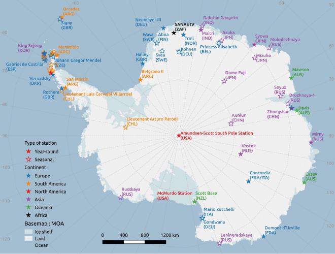
Recently, I came across another excellent example of how maps can challenge our perceptions of the world: a simple map showing all research stations in Antarctica (as of 2016). Take note of what this map highlights:
- The shape of Antarctica: I doubt many of us could accurately draw this from memory.
- Research stations as key features: quite different from an ordinary country map where such specific activities aren’t typically highlighted.
- A legend indicating whether an area is land, ice shelf (!), or ocean — knowledge that is often implicit in more familiar maps, typically conveyed through color choices.
- A “continent” legend that refers not to Antarctica itself, but to the countries that operate the research stations.
- An indicator of whether a research station operates seasonally or year-round.
These kinds of maps spark my curiosity and reinforce the idea that a map is just one model of the world — there are countless other ways to view it.
EDIT on a more light-hearted note: For Decades, Cartographers Have Been Hiding Covert Illustrations Inside of Switzerland’s Official Maps